Portfolio
A sample of interactive data tools I’ve built using R and Shiny. Each app was designed to make complex data accessible - whether for research teams, study participants, or anyone curious about a dataset.
Additional projects are in development, adapted from consulting work to demonstrate transferable capabilities.
CCC Study Dashboard
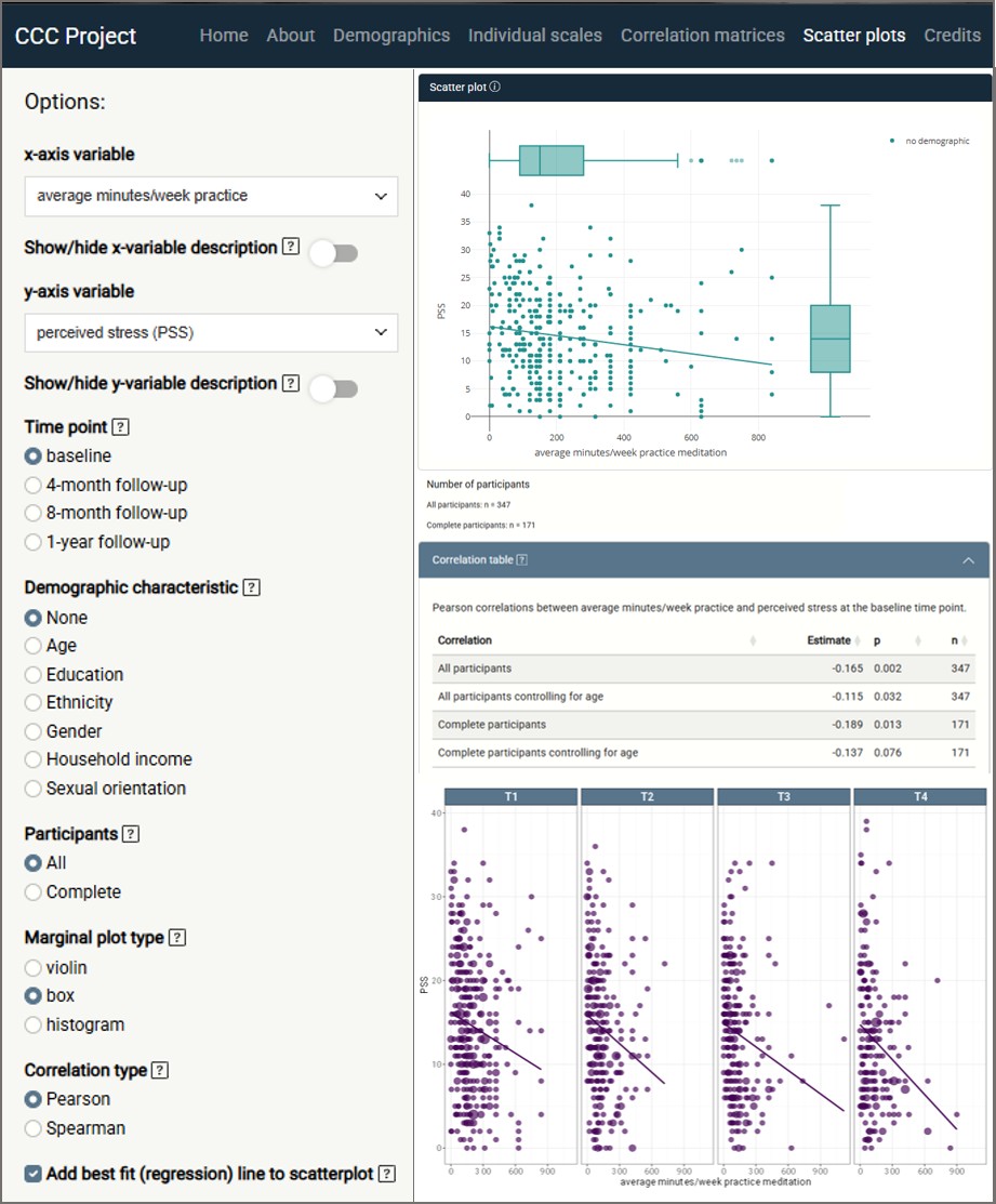
What it does: An interactive outcomes dashboard built for a UC Davis research team studying mindfulness-based coping during the COVID-19 pandemic. Allows researchers to explore participant stress exposures and wellbeing outcomes across multiple time points and filter by demographic and practice variables.
The challenge: Integrating 25M+ data points from 14 disparate sources into a single coherent interface that both researchers and non-technical stakeholders could navigate.
Built with: R · Shiny · ggplot2 · plotly · tidyverse · exploratory data analysis
Context: Academic research project, UC Davis
StayWELL Study App
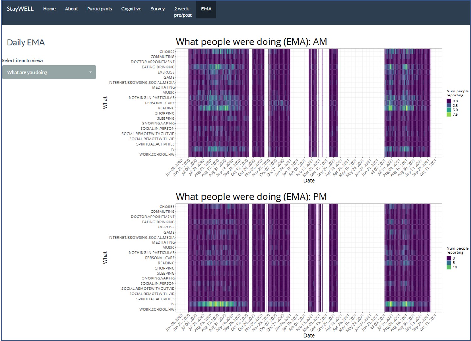
What it does: An interactive data visualization tool built for the UC San Diego StayWELL Project, which assessed the wellbeing of older adults during the COVID-19 pandemic, enabling researchers to explore and share study findings with other investigators and stakeholders. Designed to present ellbeing data in a format accessible to both research and clinical audiences.
The challenge: Translating complex longitudinal wellbeing data into a navigable interface that serves multiple audiences - from principal investigators to clinicians unfamiliar with raw study output.
Built with: R · Shiny · ggplot2 · plotly · tidyverse
Context: Freelance contract, UC San Diego (2023)
Name Explorer
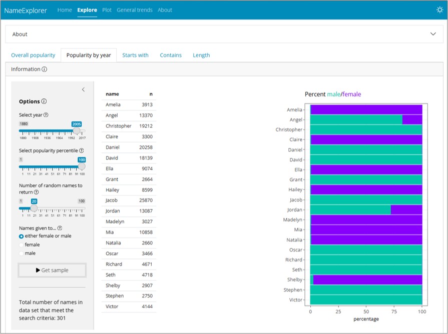
What it does: An interactive explorer for U.S. baby name trends, letting users search by name, filter by starting letter, length, or contained string, and visualize popularity over time by year and gender. A fun tool that demonstrates clean UI design and responsive data exploration on a universally relatable dataset.
The challenge: Making a large, multi-dimensional dataset genuinely fun and fast to explore - with enough filter combinations to satisfy a curious user without overwhelming them.
Built with: R · Shiny · ggplot2 · plotly · tidyverse
Context: Personal project